This week the SATURDAY SIX Proudly Presents: The Theme Park Artwork of Sam Carter! For the month of February, the SAT SIX is going to spend each weekend spotlighting an artist in the community whose work we respect and admire. We kicked off the event with SonderQuest, and this week we are going to look at the unbridled creativity of Sam Carter. Well known in the theme park community for his artwork over the years that has been showcased in the Downtown Disney’s WonderGround Gallery, Sam was an featured artist in this year’s Taste of EPCOT’s Festval of the Arts!
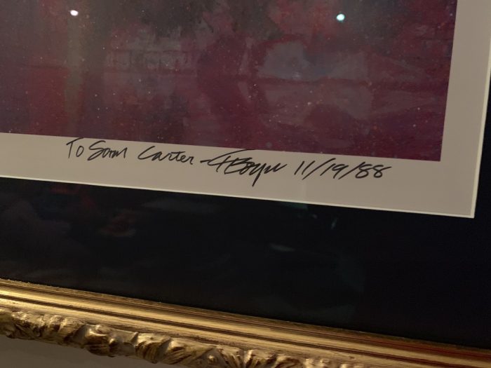
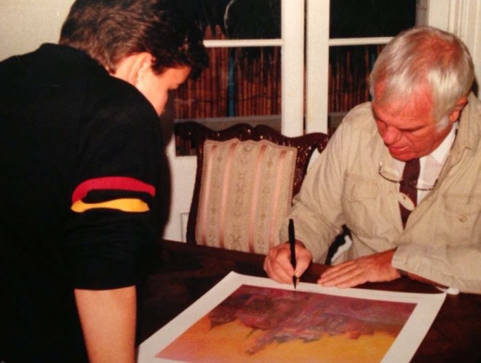
SAM CARTER: Being a part of EPCOT’s Festival of Arts is one of those things I had to pinch myself each day of the 11 day appearance at the WonderGround Gallery pop up in World Showcase. Designing artwork inspired by not just Disney – but the attractions themselves – is something I’ve always wanted to do. Amazingly enough, I have a picture of the very moment that I knew that’s what I wanted to do with my life. Back in the late ’80s, my mom took me to meet an artist at Disneyland. Not just any artist, none other than Disney Legend Charles Boyer.


SAM: The piece from that day now hangs, signed to me, in my house near where I get to create the art I’ve always wanted to create.

# 6 – Disney’s Light OdySEA
SAM: When I was in the Parade Department at Disneyland (1995 – 2006) I would always imagine the parade that I would want to design. I would sketch out ideas and themes, and one of my ideas -Disney’s Light OdySEA – was something that people really reacted to! So I made artwork for each float, and was able to practice pitching it to Show Director Marilyn Magness and Choreographer Robin Trowbridge. The experience was a pivotal moment for me, and a major key learning, something so vital to understand that it didn’t even bother me that the parade didn’t automatically get greenlit. It was about listening to what the organization decides will be initiated… to focus on those parameters, and never propose anything creative outside them. I actually apply that lesson often in my career. This was back in 2006, so at this time the properties to focus on were Star Wars, Disney Fairies, Pixar’s Cars and something new called High School Musical (HSM). This led Marilyn Magness to ask me to draw something for her because they were getting ready to propose a HSM themed show in DCA. I needed to find the movie on DVD, then draw a concept of what a show based on HSM might look like to theme park guests. I was honored and energized to be asked to make something like that. This was exactly what I wanted to do with my life. A few weeks later, a position opened up as an Art Specialist. The rest is history.


Fun Fact: The Crush float was meant to be GIGANTIC. In a way, a tribute to “Pete’s Dragon” in Disney’s iconic Main Street Electrical Parade. The Crush float would have been followed by a handful of little turtle whirly bug floats for Squirt and his brothers.


Here we have a picture of Sam when he worked in the Parade Department for Disneyland. He is pictured next to Pain & Panic, part of the Hercules Victory Parade back in 1997.

One of the floats of the Hercules Victory Parade featured The Muses.

Paying tribute to this very float, Sam used The Muses in one of his pieces for Taste of EPCOT’s Festival of Arts.

# 5 – Chalk Art
Hard to believe it has been almost a year ago now, but back in April of 2020 This Fine Blog series did an article on theme park fans Coping With Quarantine. One of the artists featured in that edition of the SATURDAY SIX was Sam…
SAM: When the world shut down in 2020, I suddenly found myself with a lot of time to actually hang out with my kids. I knew they liked chalk but I never got a chance to draw with them. Turns out when you give a nerd some chalk and a lot of time, we aren’t going to draw anything basic. I thought it would be fun to draw my own stuff in our driveway while the kids were drawing. Naturally, I took pictures of the drawings for Instagram, and people ate it up. It was a new concept to take the time and do a polished Fantasmic logo, or random sketch of the 25th WDW anniversary castle cake. I knew there most likely wouldn’t be another time to be able to have this amount of time to draw with the kids like that, so I took full advantage. Once the photos went online, people would post pictures of their version of the WDW 25th castle cake, etc. I’m glad that I inspired some people to draw something fun and different with chalk and in a way got to Pay Forward the inspiration I got from other Disney artists.


# 4 – TRON Mural for Disneyland
When you start going down the rabbit hole as a theme park fan, one of the most interesting things to discover is unused concept art. Being introduced to things which “might have been” for the theme parks is tantalizing. Seeing these possibilities that never happened is like stepping into an alternative universe. As a movie fan, it is like when footage came out showing that Eric Stoltz was originally cast as Marty McFly in Back to the Future, even shooting many scenes before being recast with Michael J Fox.
SAM: Some of my projects never see the light of day. For example, the TRON mural that I designed while working in Creative Entertainment was supposed to go into Disneyland’s Tomorrowland. It was completed, but the project changed and Disney never used the art. Which is still fine – because it ended up in my portfolio and on social media for people to enjoy.


# 3 – Buena Vista Christmas Tree
SAM: In 2011 I partnered with David Caranci from Resort Enhancement on getting the new additions for California Adventure ready for their new Christmas seasons. The most exciting part was helping design the new main Christmas tree for the theme park. Over the years, DCA never had a real consistent location for their Christmas tree, a stark difference from across the esplanade where Disneyland has had their tree prominently displayed for more than half a century.
Buena Vista Street was themed to Los Angeles in the 1930s, which was a beautiful thematic story flow from the entrance to Disneyland just steps away. Disneyland gives guests a glimpse at Walt’s childhood in Missouri for Main Street USA, then later shows when he arrived in Hollywood for Buena Vista Street. This new hub for the Park would feature the ideal planter for a large Christmas tree centerpiece. However, what was interesting here was that the surrounding buildings for our new tree weren’t built yet, as DCA was going through a massive transformation into the park we know today, so I created some concept art to help capture the feel of this new area for the holiday season. This art was then used for the fabrication of the tree, as well as being used in marketing to get guests excited about what was coming to DCA for Christmas.

SAM: The question we were presented with was how to make this tree stand out on its own apart from Disneyland’s iconic tree. We researched what a typical tree looked like in the 1930s and focuses on the types of trees and branches that were used and how they were decorated and trimmed. Taking it a step further, we discovered that Walt actually licensed a set of Mickey Mouse ornaments in this timeframe.
They were a set of illuminated colored bells, with hand drawn images of Mickey and his friends. Based off that original art, I hand drew each bell’s design and characters. Each drawing was then applied to the light up bells.


The final results…

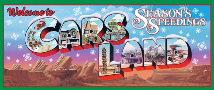
Sam also designed this decorative sign to be used in DCA for the holiday season.


# 2 – Bumblebee Man’s Taco Truck (Universal Studios Florida)
DCA’s evolution into Buena Vista Street and Carthay Circle was elegant and classy. Around that same time, Universal Studios Florida went the other way when expanding out their area of Springfield USA. As a lifelong fan of The Simpsons, this was a dream come true. Where once was just a ride was now a full-fledged land with Fast Food Blvd, Duff Beer, and filled with next level jokes! One of the new additions was a new food truck themed to Bumblebee Man. The fact that Universal was doing such a “deep dive” into The Simpsons universe was exciting, but imagine my surprise when I found out of my favorite theme park artists helped create it!
SAM: This started out as being based on being built out of the “Channel Ocho” news truck, which explains the shape. Then it slowly evolved into what you can now see in the land.


Speaking of the Universal parks, one of my favorite things that Sam Carter has drawn is a series of silhouettes that feature a particular film’s character along with a moment from said film. Many of these drawings involve franchises that are near and dear to the hearts of many Universal theme park fans. First up we have the character Brody, from Jaws.

Followed by Dr. Ian Malcolm, from Jurassic Park.

Next up is Elliot, from E.T.

We conclude with an incredible series of illustrations, each featuring a character from the Back to the Future films and the clocktower from a moment in, well, time. Clara (with the clocktower being built in 1885), young George McFly (the night the clock tower was struck by lightning in 1955), Marty McFly (the clocktower in 1985), Biff Tannen (the clocktower in the “bad” version of 1985), and Dr. Emmet Brown (the clocktower in 2015.)

# 1 – EPCOT’s Taste of the Festival of the Arts
SAM: At this year’s Festival of the Arts, seeing other fans of Disney, and even some fans of my art was a blast. I was stoked to finally meet so many of the people that I chat with daily on social media, plus meeting a whole lot more people who just happened to be art lovers enjoying the festival those days. I got a kick out of how many people who only knew me as “that guy @Cartarsauce on Twitter,” were surprised I actually make art in addition to being chatty and opinionated online about the Disney Parks.
I’m definitely a chatter, so if there was a line at all to see me, it wasn’t because I’m in high demand, it was because I wouldn’t shut up about some random discussion about Guardians of the Galaxy vs Tower of Terror, or the massive barges that were being brought out to the center of World Showcase Lagoon. I often had to thank the people next in line for their patience. Hopefully it was worth the wait.


In addition to the Muses drawing we mentioned earlier, Sam created three more pieces that made their debut during the Festival. They were each based on iconic Disney attractions: Enchanted Tiki Room, Country Bear Jamboree, and Walt Disney’s Carousel of Progress.
For the Carousel of Progress artwork, the character John was drawn during his various stages of the attraction. Note all the small details in the background, such as the turkey burning in the oven.

Before starting his drawing, Sam did a preliminary mock up using the audio-animatronic John from the Carousel of Progress.


SAM: What could be seen as a good problem was that a lot of my artwork was sold out before and during my appearances. So to help keep the folks happy I stopped by a local Orlando Michaels and grabbed some art supplies. If anyone was upset that the piece they came specifically for was sold out, I would draw them something to try to make up for it. I took it a step further and drew something to use as a giveaway each day. At first not knowing if anyone would play along, but it turns out every single day that I did it, the very first person I met knew the “secret word” and was very happy to get some free art.


SAM: One of the more touching things of the Festival was my 5-year-old twins who were along for the 2 week adventure, it felt special to have them call this amazing experience “Daddy’s Art Show”. I hope it’s a fun memory they never forget, because I know I won’t!

HONORABLE MENTION – Park Map
Let’s face it, most people reading this love a good park map. In the moment, they seem unnecessary as many of us know the parks like the back of our hand. It’s not until years later, when we go through old park maps that we saved, that we get a glimpse back into the way the parks once were. We can be immediately filled with nostalgia, and fondly remembering back to the days when we visited, seeing stuff that is now gone that we miss, or looking back and thinking “I can’t believe that actually existed.”
However, one thing that often goes overlooked in these park maps is the artistry involved behind them. The maps are so ubiquitous to the theme park experience that we usually don’t give them a second thought, but a lot of work goes into them, and some become beautiful pieces of artwork.


So there you have it: SATURDAY SIX Presents: The Theme Park Artwork of Sam Carter! See you next weekend for the latest installment of the SATURDAY SIX, where we’ll look at something fun from the world of Disney and Universal. If you enjoyed yourself, be sure to check out The Magic, The Memories, and Merch! articles covering the latest from the Disney Outlet Stores. You can also follow Your Humble Author on Twitter (@derekburgan).

If you enjoyed this article, you will surely like the following:
SATURDAY SIX Presents: The Theme Park Artwork of SonderQuest
SATURDAY SIX Presents: @bioreconstruc’s Favorite Aerial Photos
DAVID & DEREK: The Do’s and Don’ts of COVID-19 Safety Protocols at the Theme Parks
6 Pieces of Disney Merchandise That Don’t Exist (but Totally Should)
SATURDAY SIX Presents: The Disney Signage Hall of Shame
Special Thanks to The Elite Brandon Glover, the bio-est of all reconstructs @bioreconstruct, Captain Cruiseline Scott Sanders of the world famous Disney Cruise Line Blog, my personal protege Hunter “Elvey” Underwood, artist @SonderQuest, the SAT SIX Fun Squad of Parkscope Joe and “the Dadalorian” Nick, hot shot Michael Carelli, charter member of the Universal Four @Nitro230, and Hermione Granger’s tutor Megan Stump for their invaluable assistance with this article. The SAT SIX is inspired each week by goofballs Aengus Mackenzie and LitemAndHyde and you Potterheads will enjoy Meg’s other blog work over at the Central Florida Slug Club.

The post SATURDAY SIX Presents: The Theme Park Artwork of Sam Carter appeared first on TouringPlans.com Blog.


