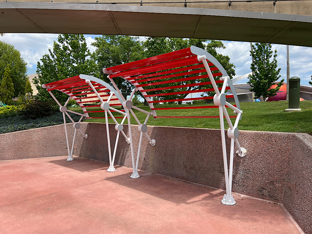
I’ve always loved design, and as someone who also loves all things Walt Disney World, the design of Disney has a special place in my heart. EPCOT’s World Discovery (the former Future World East…which I’m sure I’ll continue to refer to as Future World East, thankyouverymuch) has had a bit of makeover recently, and I thought it would be fun for you and me to take a little look at what changes have come to the area.

There’s a new common color that guests will be able to find sprinkled throughout the area, and I really feel like it succeeds in pulling everything together nicely. It’s similar to the bright coral color found on the giant model of Mars outside of Mission: SPACE. It’s a vibrant red-orange, and it’s a bit of a fun scavenger hunt to find all of the items that have now been clad in the vibrant color.

You’ll see the red-orange used on directional signage, the Connections Eatery and Cafe entrance arches, umbrella posts, and even World Discovery’s misting fans have now been outfitted in the beautiful, cosmic color.

The makeover extends to the area’s Joffrey’s Coffee location, too. The stand now sports a futuristic theme and new sign, and features World Discovery’s new color of the moment.

The pillars that surround the area’s splash pad have also been painted, and all of the surrounding trash cans have also gotten in on the act.

Even the New Guinea impatiens planted in the raised flower beds coordinate. And you know what? That’s the kind of attention to detail that brings joy to this EPCOT lover’s heart.

I know that EPCOT is in the middle of a time of readjustment and reimagining, and it’s a bit of an old-made-new kind of moment. And it might be tempting to think that things are being overlooked or that so much change is coming that it’s simply a fragment of what it used to be. It’s touches like these that speak to the idea that the little things are still important. Cohesive theming is still present, and while you and I might argue ’til we’re blue in the face over whether or not the Guardians and the Xandarians should have moved into the neighborhood (I’m very much in favor), it’s the simple addition of a color theme that can bring you back around. It’s thoughtful, and purposeful.
And these days, we need all of the thoughtful and purposeful that we can get.

